Into the Rabbit hole
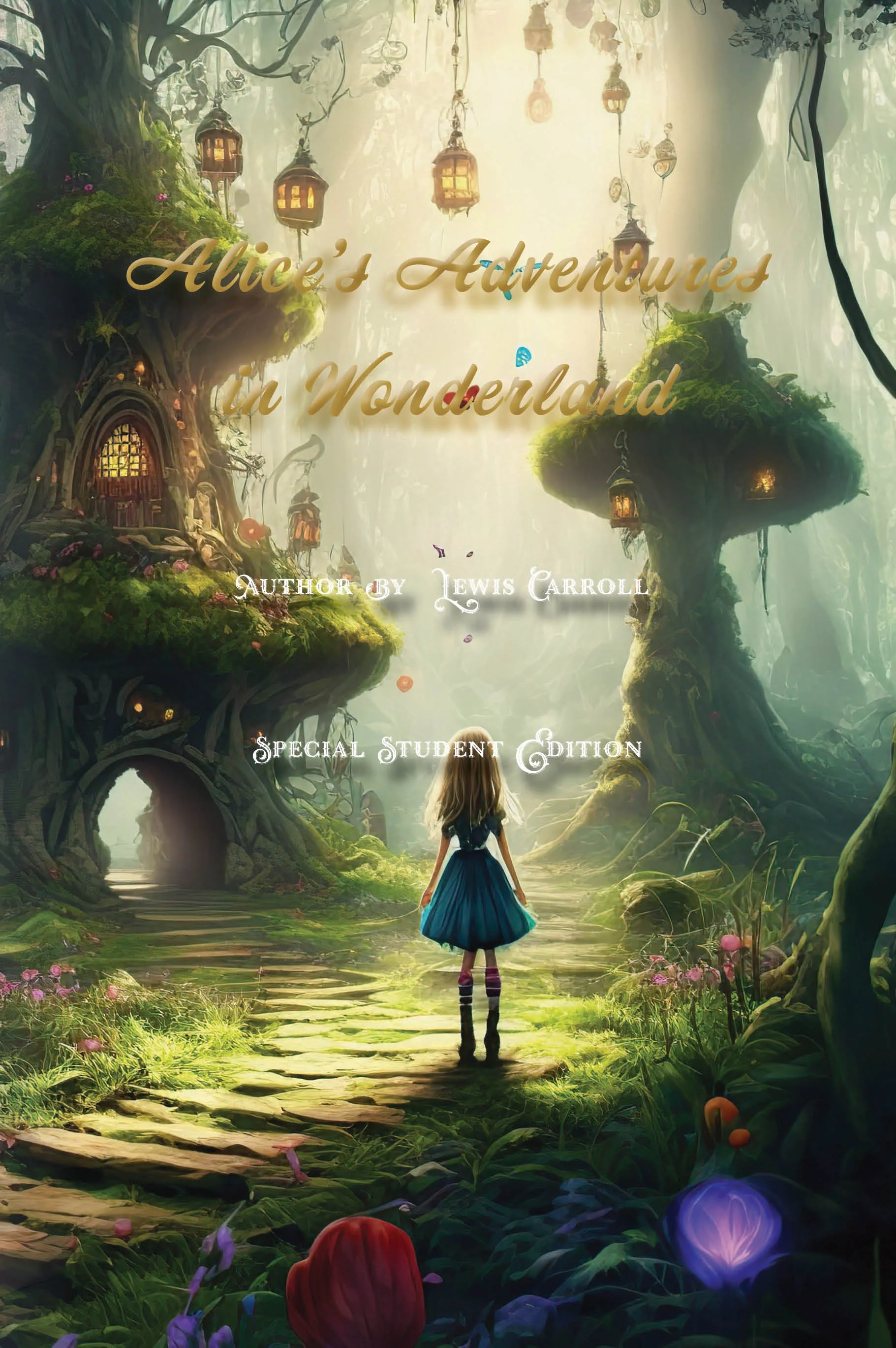
Alice’s Adventures in Wonderland
Design Decisions
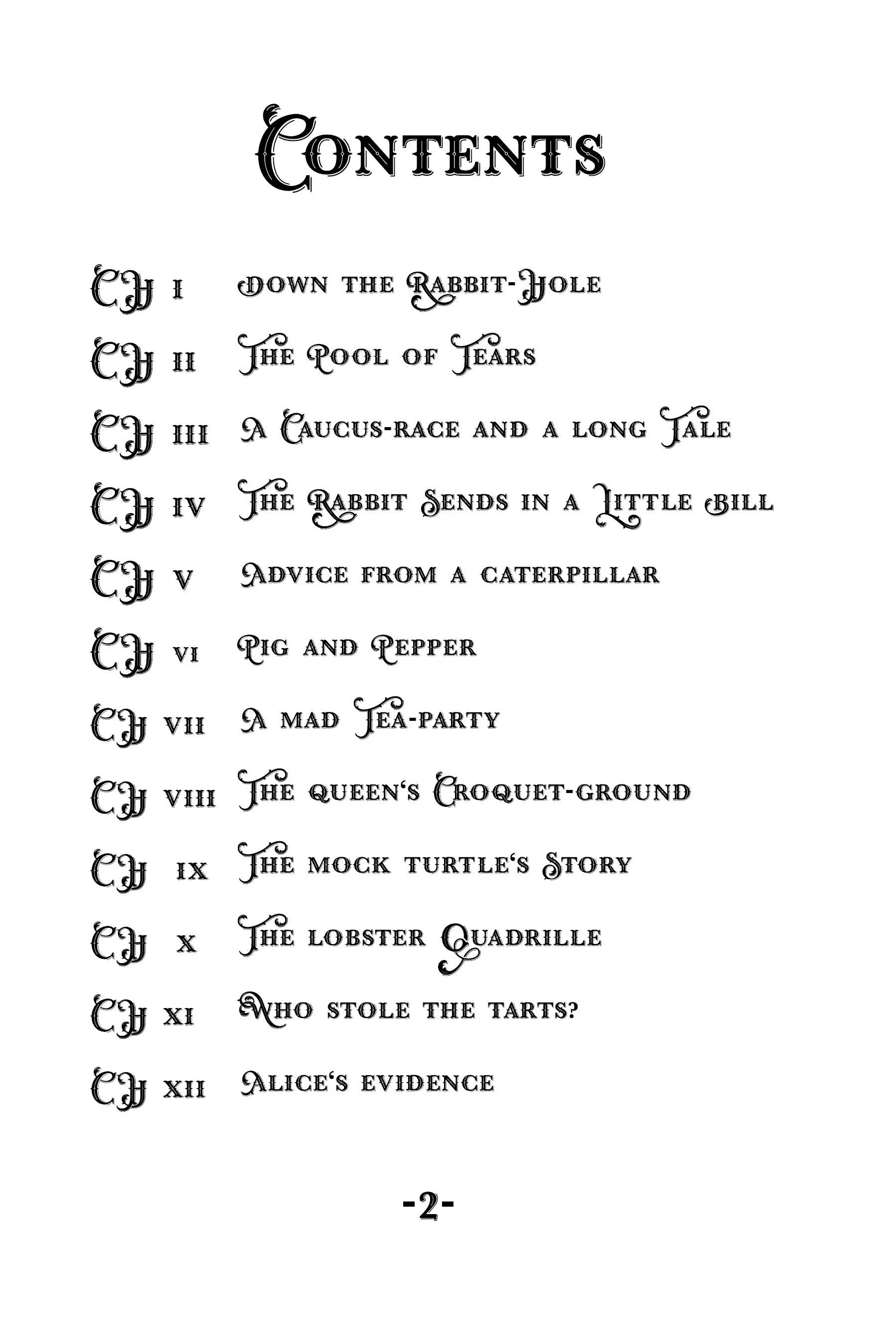
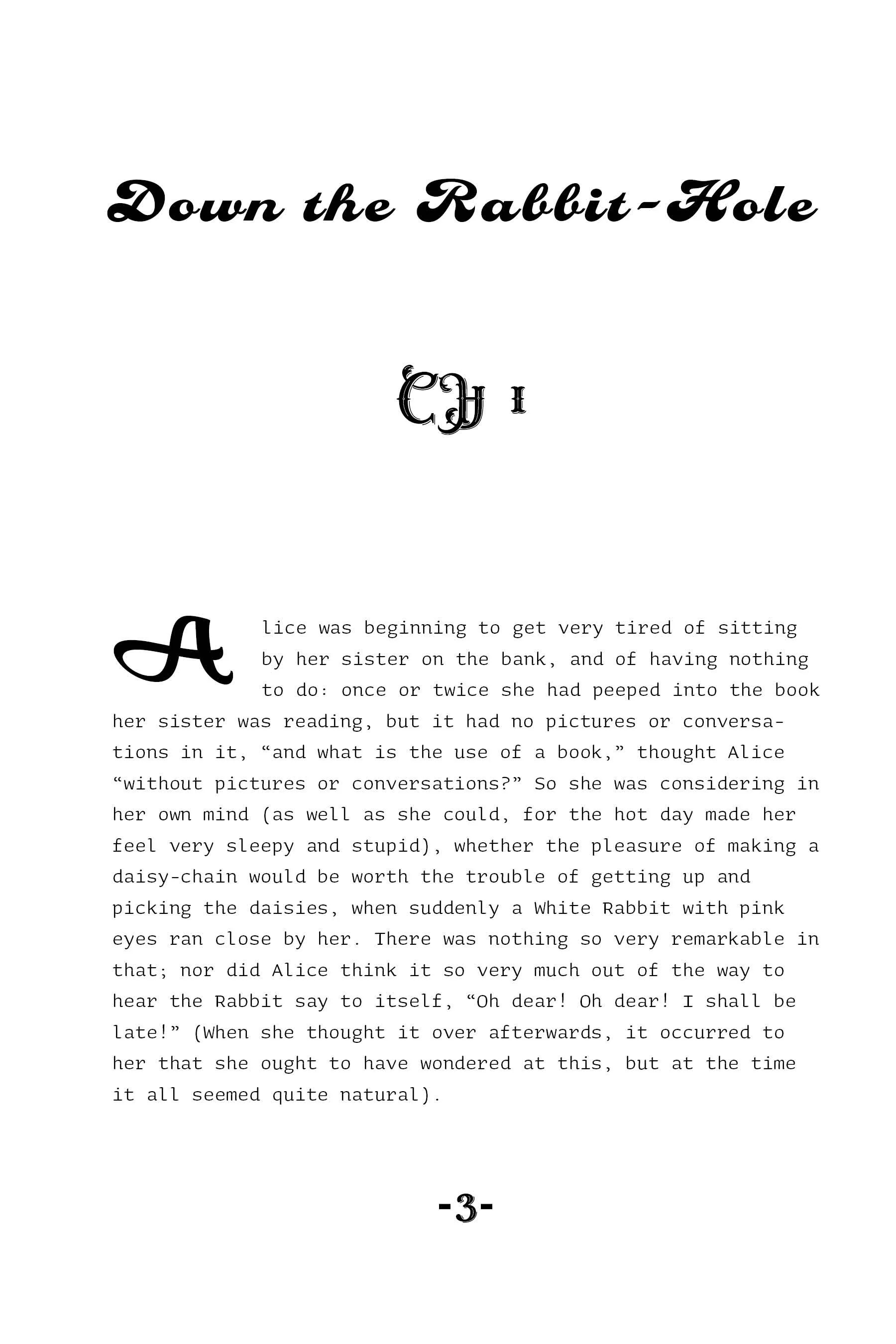
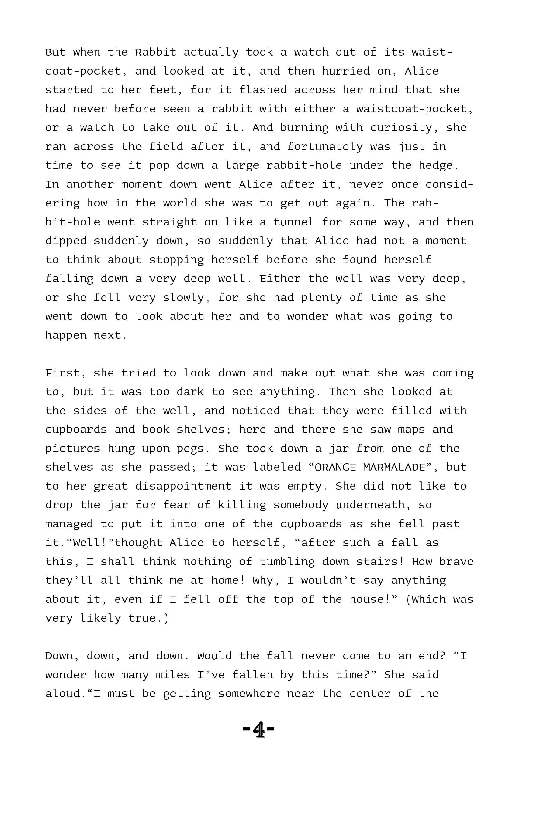
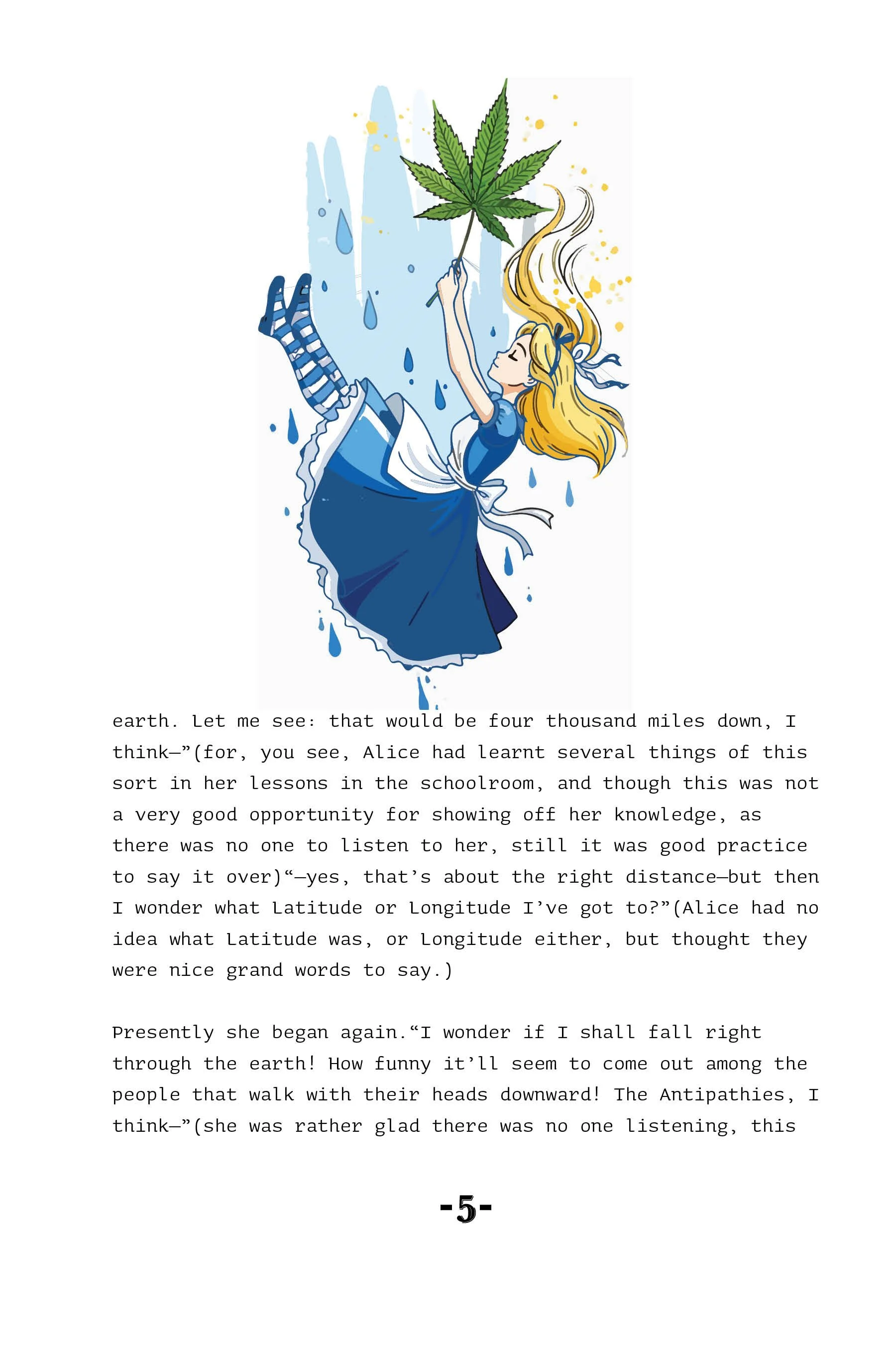
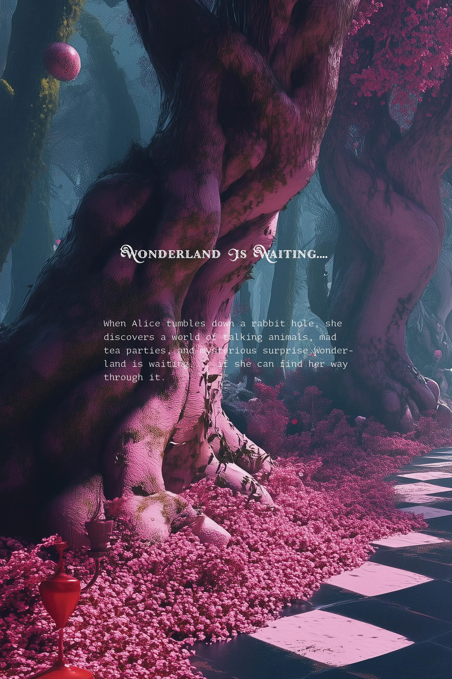
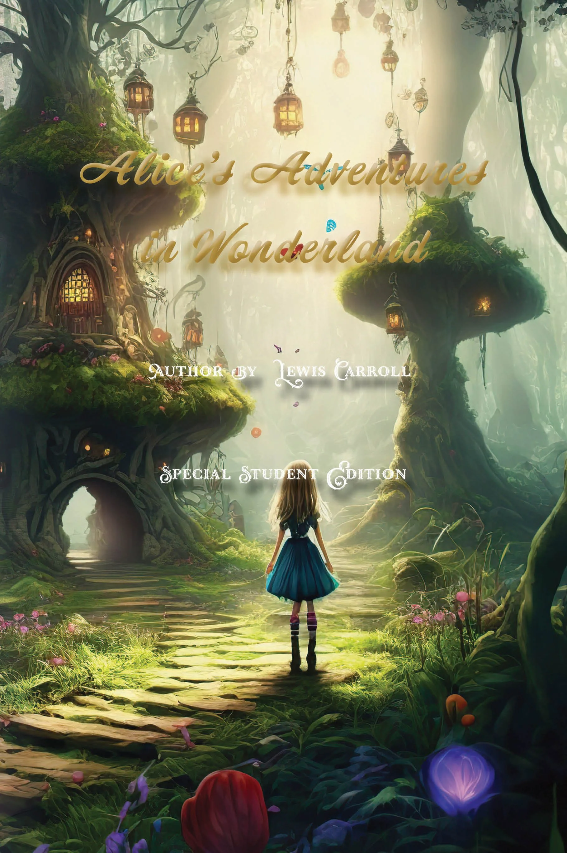
The design focuses on creating a classic and fantasy experience. I selected decorative serif and script typography inspired by the Victorian era to reflect the historical context of and to reinforce its whimsical quality. The use of black and white colors enhances readability while maintaining an elegant, vintage aesthetic. A structured layout with a clear hierarchy and generous white space guides the reader smoothly through the text and emphasizes key elements, such as chapter titles and drop caps. Ornamental details and stylized headings contribute to the fantasy, helping to draw the reader into an imaginative world of the story.
Tool Used
This project was created using
Adobe InDesign for layout design, grid structure, and effects
Adobe Photoshop for image editing and color layout
Reflects Strength
This project highlights my strengths in editorial design, particularly in typography, layout composition, and visual storytelling. I focused on developing a fantasy brand identity that aligns with the Victorian audience, blending elegance with a sense of whimsy. It also demonstrates my ability to balance aesthetics with function, ensuring the pages remain visually engaging while maintaining clear structure and strong readability for a smooth reading experience.